What is a heatmap?
Website heatmap, the meaning is the same as the name implies, it is used to display the webpage as a heatmap to show the degree of enthusiasm of your site visitors on the area of your site. Through the visitor’s click, browsing time, browsing area and other data, the heat map will reflect the behavior data of the visitor while staying on your webpage in the form of colors, such as red and blue.
Different colors represent different popularity. The areas with fewer clicks and shorter browsing time will show a colorless or blue-green state, otherwise the red state. The greater the number of clicks and the longer the browsing time, the denser the data points collected, and the redder the color. It is like looking at a tiled map from the perspective of God, we can see various routes and various behaviors from passengers, including both reasonable routes and unreasonable routes.

The common website heat maps can be divided into the following categories:
-
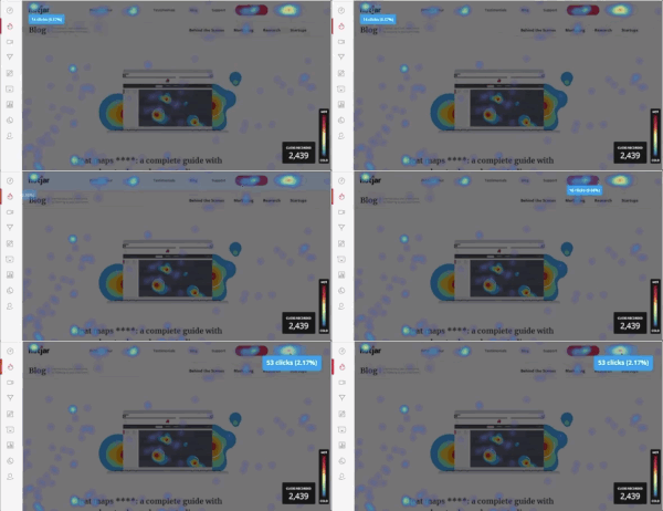
Click Heatmap
This type of heatmap records the position that visitor clicks on the page, including buttons, links, images, text, and locations that cannot be clicked. We call them valid clicks and invalid clicks. The valid clicks include link clicks and interactive clicks without links. The invalid clicks refer to blank areas with no links or interactive elements.
This type of click data can directly reflect the interaction between site visitors and webpages, it can help us to analyze the elements that visitors are most interested in, the data they may want to understand, and the best place to place an effective valid clicks. For example, a place to put the button on.
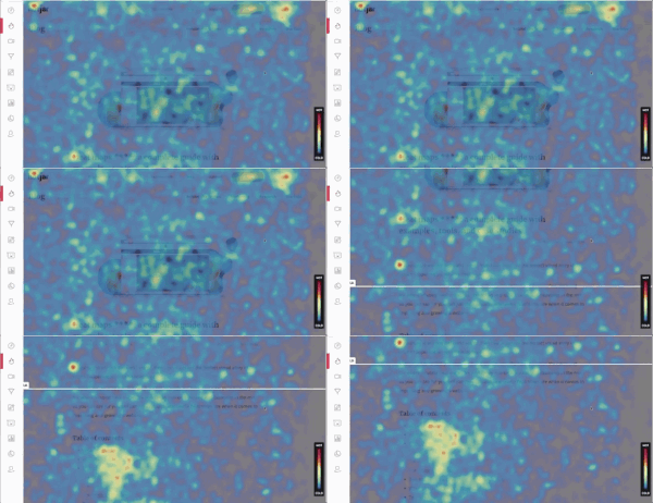
2.Mouse Movement Heatmap
This type of records the webpage area that the visitor’s mouse or finger slides on and where they stay. This is a way to record the movement of the visitor’s behavior. We can determine the website location information and browsing trajectory of their browsing interest.
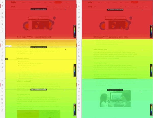
3.Visitor Scrolling Heatmap
This type of heatmap records the screen stay time of visitors in the visible area of the page. The longer time they stay or browsing, the redder the color is. Usually, visitors will stay in the area of what they interest, we can use this data information to determine the interest of visitors in the area they stay and the area they bounced quickly.
Why do we need the heatmap?
The design and experience of the landing page will directly affect the conversion of visitors, and the heatmap will most intuitively show the “deficiencies” on the landing page.
A website heatmap is an important tool used by digital data analysts to analyze the behavior data of web page visitors, it allows you to understand the psychological activities of visitors and how their behavior path works, from that we can achieve the data visualization. Heatmaps can be presented in clustered, linear, or logarithmic forms to identify the uneven distribution of data across threads.
Digital data analysts can use the colored data points accumulated by the heat map, to analyze the intent of the visitor to reach your page and understand how the visitor’s click, browse, and their area of interest. In this way they can quickly measure the conversion rate of the landing page, and find out the true reason for visitors to bounce out the page. Then we can adjust the page layout to optimize the page in accordance with the visitor’s behavior trajectory, concerns, and browsing habits to reduce the bounce rate and achieve the best effect of improving the conversion rate. It can be said that the heat map is the best tool for analyzing and optimizing the websites.
How to analyze the elements of the landing page that need to be optimized through the heatmap?
To understand which elements of a landing page need to be optimized, we need to know which elements can be tested first. Next, we can use a few small examples to learn what parameters can be used to test the heatmap.
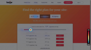
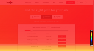
Clicks Test: Did the visitors click on the right place?
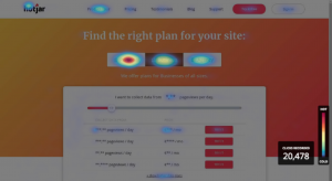
Through visitor’s clicks, we can collect various click behavior data from the visitors. Assuming your webpage click heatmap shows that visitors often click on those non-clickable elements when they visit your website, then this may indicate that the visitor’s interest in this clicked area is relatively high, and when they visit the landing page to view and click on this non-clickable element, the invalid click may cause them to feel frustrated and bounce out.
Optimation:
When this situation is found, the optimization we can make is to make the invalid clicks become effective valid clicks, and add corresponding effective interactions to the frequently clicked areas to reduce the bounce rate of visitors. For example, add links with clickable elements, pictures, or even create a pop-up window with corresponding information.
Interest Test: Where and what do your visitors interest in?
Analyzing which products or information visitors are interested in is the most important part of website optimation. The data collected from click heatmap, movement heatmap and scrolling heatmap will well show you the information and the interest from the visitors.
Optimation:
The data collected from the heatmap can be used for information collection and position adjustment and optimization. This type of test can also appear in the form of a survey. For example, BYO once added 3 course selection buttons to the event landing page made for an educational institution. Visitors can click on the most interesting courses by themselves. And from the click heatmap we can directly see that the most attractive course to visitors is the one with the reddest button. Example 2: Add non-clickable fake buttons on the page to test out the goods or services that are of most attractive to visitors.

Interactive test: What do visitors really want? How to interact?
The interaction between the visitor and the webpage is also an important factor leading to the final conversion, and interaction testing is a way to judge the attractiveness of the website. From the heatmap, we can see that the interaction rate between visitors and the website itself is high or low. Most visitors who enter the page will look for the content they want to see in a short time. If the content is not eye-catching, it may cause them to bounce out quickly. If the visitors do not have any interaction or too little interaction with the webpage, then we can conclude that the content of the webpage has not achieved an effect of attracting visitors. At this time, we must optimize the interactive elements.
Optimation:
It can be optimized for low-click and low-interaction areas, the layout and adjustment of the areas and content can be re-typed and adjusted according to the data by the heatmap to increase the interaction rate.
Content Test: Is the site missing some key information? Does the content meet the expectations of visitors?
The content test can find out whether the webpage meets the expectation of the visitors through the heatmap, including whether the page contains the information the visitor wants to see and whether the content of the information activity meets the expectation.
Assuming that the content of the webpage is sufficiently eye-catching, visitors can see the entire content of the page and read it carefully on their first visit. We can use the heatmap to find out whether the visitor browses the entire page. Through the movement heatmap, we can see whether the visitor has browsed all the information, and content. Another situation is to browse the content information but failed to attract them.
For example, BYO once made a landing page for a mobile phone company. After advertising for a period of time, we found from the heat map that visitors lingered for a long time in the mobile phone promotion plan section, but the information button below is has a low click-through rate. We can find that visitors are not interested in the plans provided by the company, failing to meet their expectations and thus not converting.
Optimation:
If the webpage lacks information, we can set up a pop-up box when the visitor is about to leave to ask why the visitor jumped out and complete the information afterward. If the content itself does not attract visitors, it can be adjusted accordingly based on the visitors’ feedback information.
Distraction test: Is there any other irrelevant element that attracts the visitor’s attention, and then resulting in a lower conversion rate?
Often we see that the visitor’s traffic high but with low conversion rate. At this time, click heatmap and movement heatmap can well show the visitor’s behavior, so you can analyze why they bounced. One of the factors for them to bounce out is that the visitor’s attention after entering the page is attracted by other information on the page, thus forgetting his original purpose of entering the page, resulting in failure to convert. The most common situation is that many customers think that the more information they put in the landing page, the better page is. However, when too much information on the site is not related to conversion, it is easy to distract the visitor.
Optimation:
You can try to delete irrelevant information, increase the attractiveness of the page content to reduce the bounce rate, and improve the conversion rate.
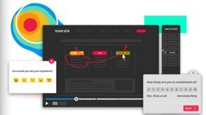
Section Test: Which section on the website keeps visitors away? Did the visitor slide down to browse all the content below the page?
The home screen of the page is the first impression for the visitors, and the home screen needs to attract the visitor’s desire to continue to scroll down the browser. Through the red area reflected in the heat map, we can see which section the visitor stays the longest time, so as to determine which section the visitor has the most interest. The heatmap can also reflect whether the length of the page is too long and whether if it can attract visitors to the bottom to see all the information content.
Optimation:
For the feedback information from visitors, combining two data together can adjust and optimize a layout. Simplify the content of the home screen, place key information, and keep the visitors to continue to scroll down the page.
Are the optimizations after test always correct? What if we make a mistake?
The optimization conclusion after the test only provides a possible way to optimize. Usually, an AB test is performed according to the original and optimized versions to compare the effects for a period of time. Finally, use the heatmap comparison to verify the speculative results.


